UI/UX
Hotel Results Card
2015-2020
Problem
As a user, when seeing hotel results cards on various platforms, there are inconsistent, unscalable and unscannable.
Hypothesis
Result cards are the core of the search experience. Our strategy for cards varied significantly across platforms, and does not sufficiently highlight the value of what makes our core differentiator truly great. We seek to re-imagine our search result cards through a cross-platform, mobile-first lens.
Goals
Success will mean designing a new result card that is:
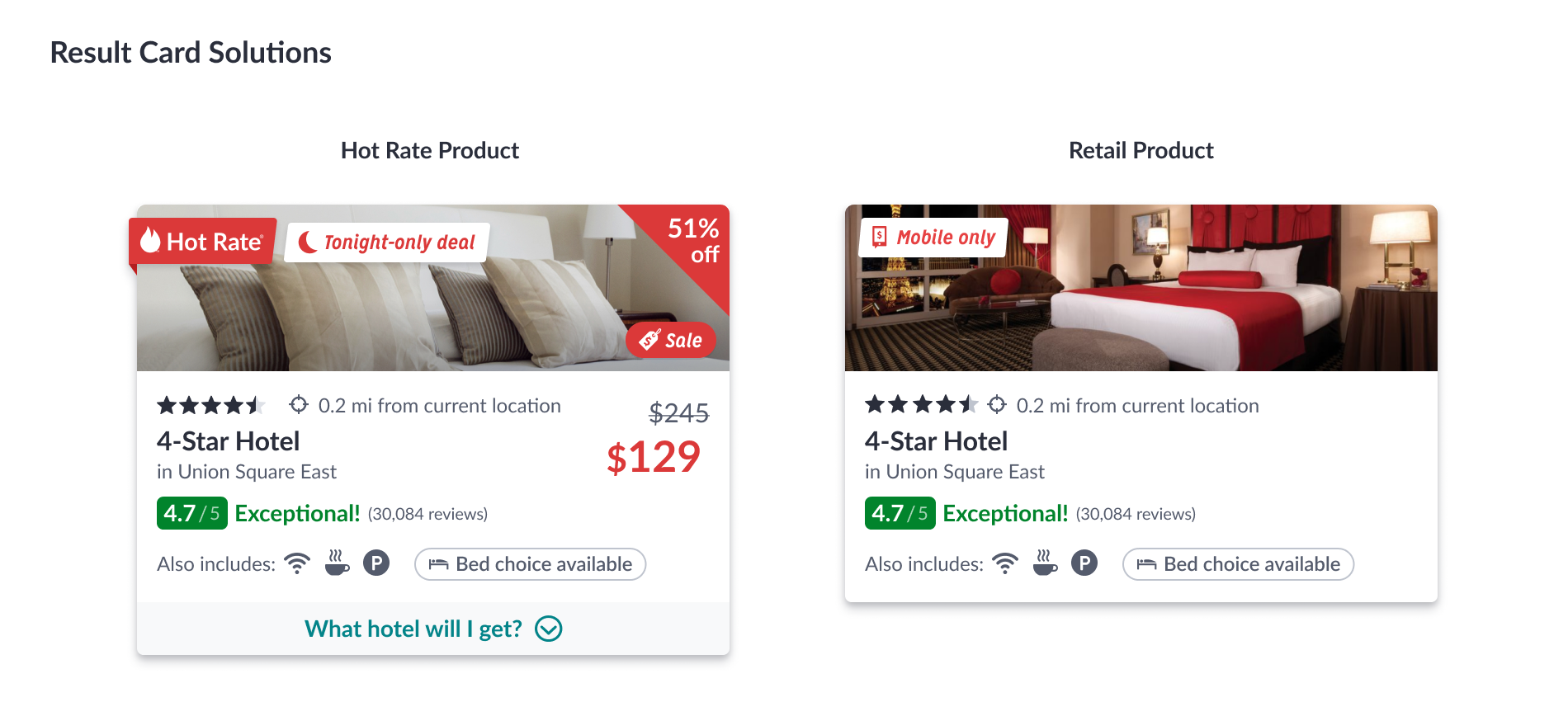
-- Effective at communicating the value of our core Hot Rate product, making it stand out and desireable.
-- Design an optimized mobile-first search result card.
-- Discoverable, structured content that is easily scanned and emphasizes the most relevant content for decision making.
-- Scalable, with zoned structure that expands/contracts to accommodate varying amounts of content as needed.
-- Unified, with a consistent layout framework & visual design language across platforms.
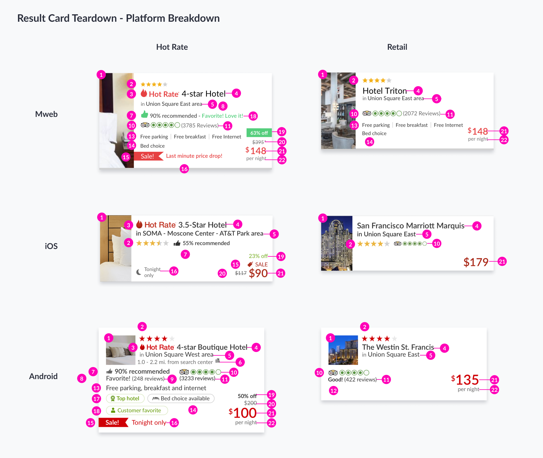
Content breakdown on each platform.

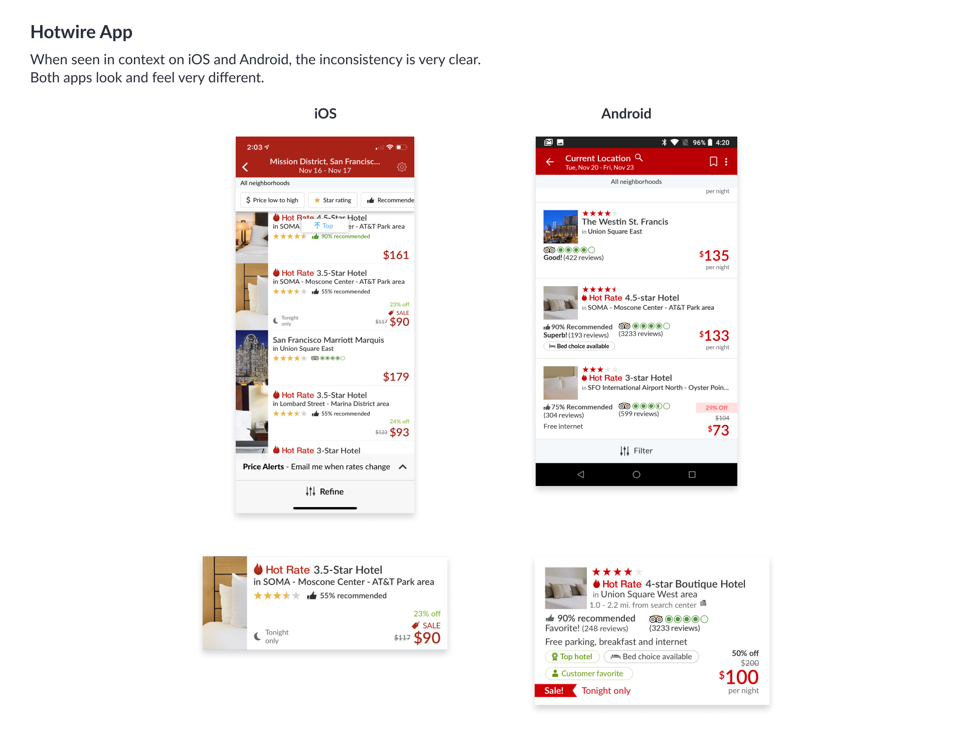
How we managed to unify our search result card.
Eye Tracking Testing
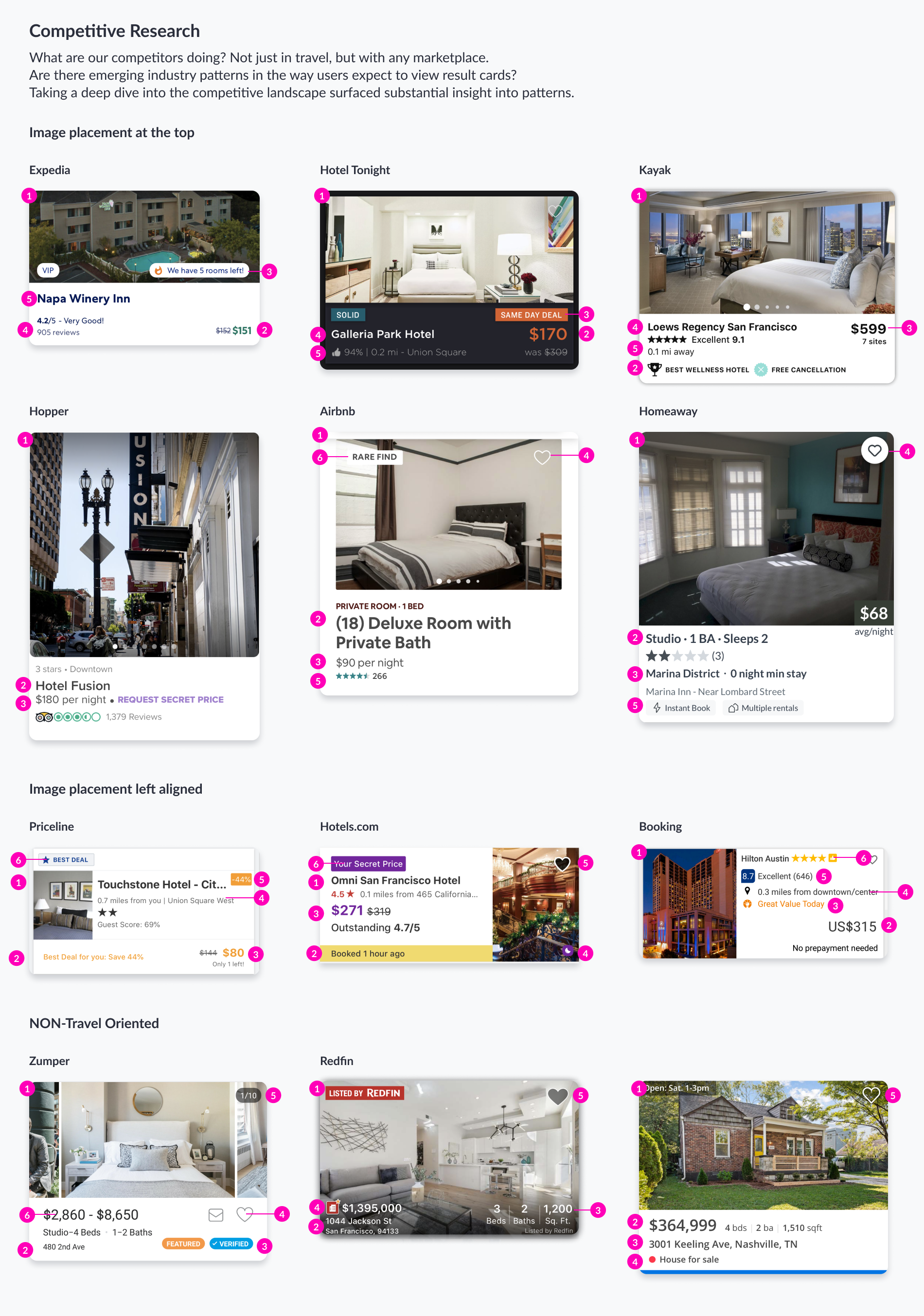
What did we learn from testing multiple competitors?
Eye Tracking on Potential Solutions
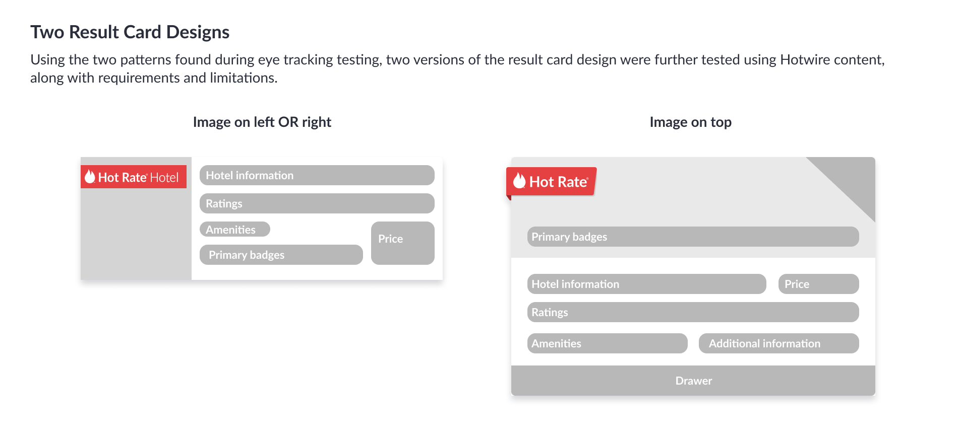
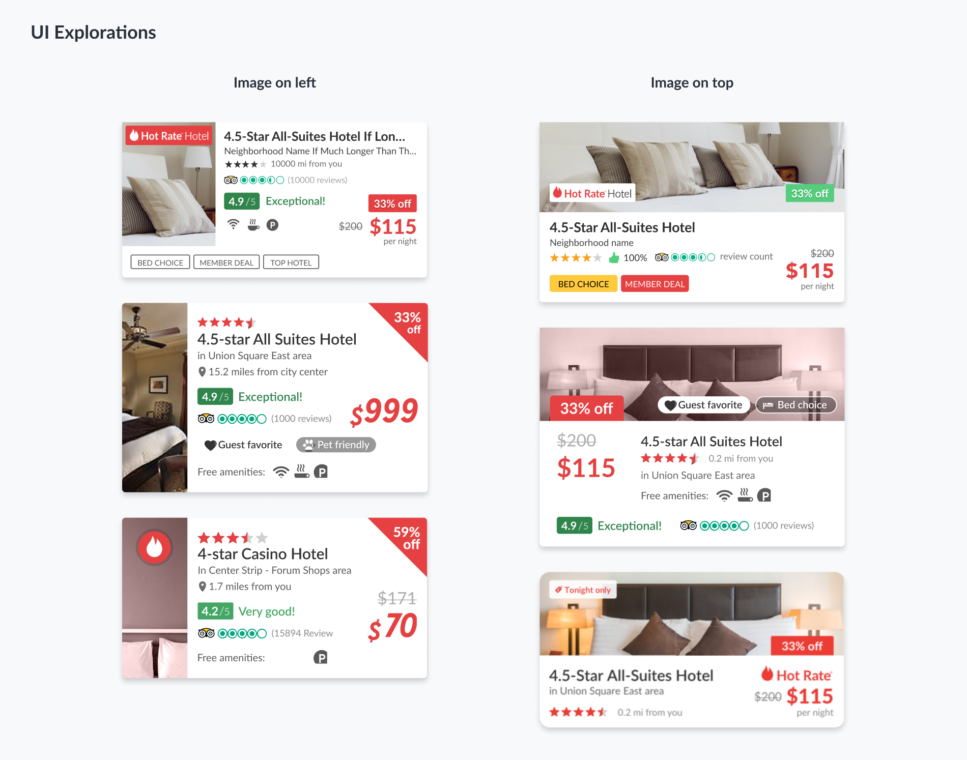
Using what was learned from the eye tracking results on competitors, and the patterns found, I designed and explored result card designs following the F and Z patterns.
Two versions of the result car were tested, the image left aligned, and image placement above the content. We saw that users overall, could compare, understand and preferred the design with the image above the content. The z pattern allowed users to scan the card top left and end bottom right.
Users were able to scroll down and glance at the result card with greater ease and confidence.